
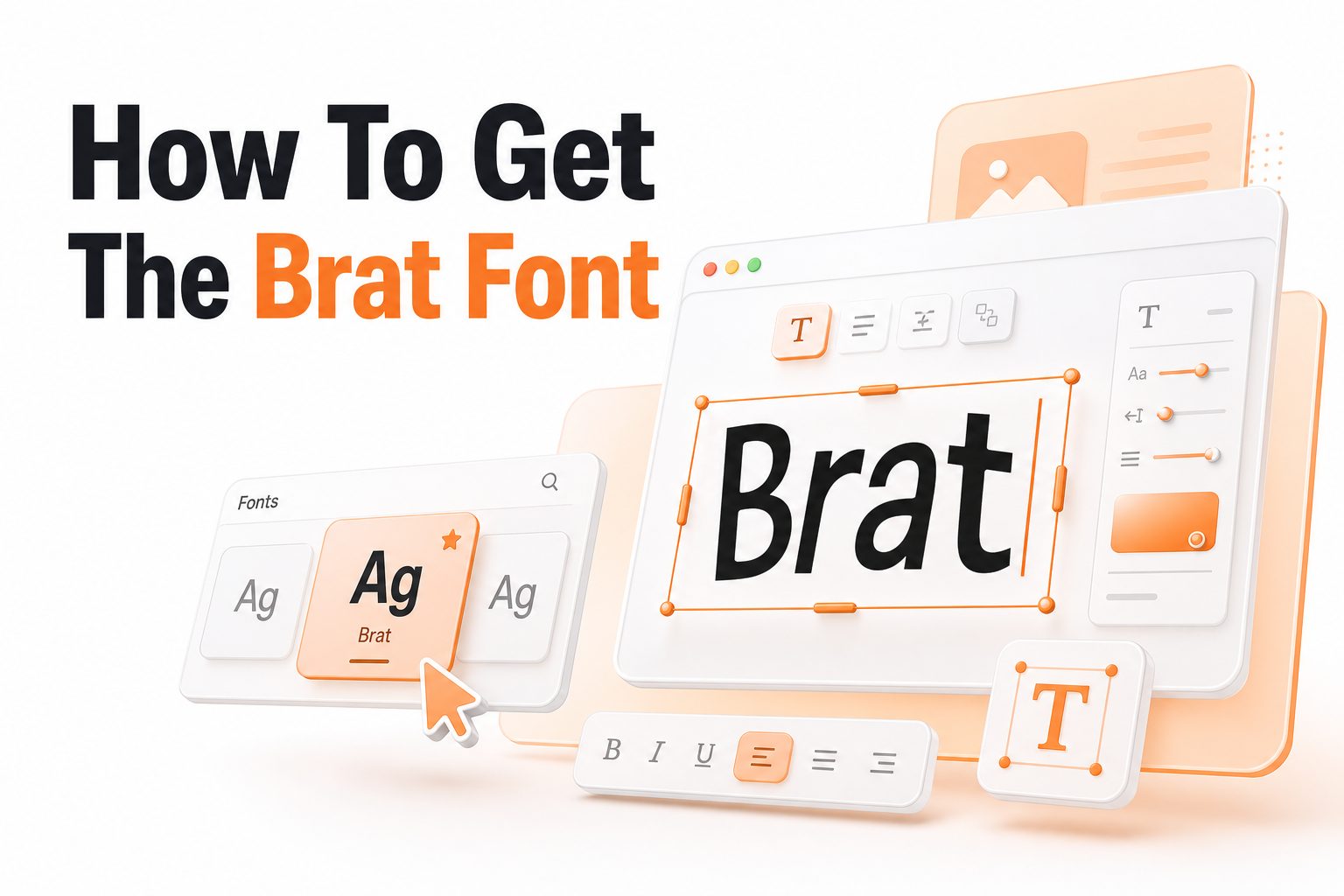
The phrase how to get the brat font became popular after Charli XCX’s Brat album cover turned a simple type treatment into a recognizable visual style. The look is plain, stretched, slightly imperfect, and tied closely to that bright green background.
The main thing to know is that there is not one official public “Brat font” you can download from the album artwork. Most recreations use common sans serif fonts, especially Arial Narrow or similar condensed fonts, then adjust spacing, blur, and texture.
This guide shows practical ways to recreate the Brat-inspired look for personal graphics, social posts, thumbnails, and mood boards. You will also learn how to avoid common mistakes, choose safer font alternatives, and keep the result readable.
What People Mean by the Brat Font
When people search for how to get the brat font, they usually mean the overall album-cover style rather than a specific licensed typeface. The design is built from plain lowercase text, a narrow sans serif shape, low polish, and a slightly fuzzy printed effect.
The style works because it feels anti-glossy. Instead of polished luxury branding, it looks direct and casual. That plainness makes it easy to imitate, but small details matter if you want the final design to feel intentional rather than unfinished.
The most recognizable parts are lowercase lettering, condensed character shapes, soft blur, and a green background close to the album’s visual identity. You can recreate the mood without copying every detail exactly, which is often the better choice.
Quick ways to recreate the look
- Use Arial Narrow, Helvetica Condensed, or a similar narrow sans serif font.
- Set the text in lowercase for a closer match.
- Keep the layout simple, usually centered.
- Add a very light blur or softening effect.
- Use a vivid yellow-green background.
- Avoid extra icons, shadows, outlines, or decorative elements.
- Export at a size that keeps the text slightly soft, not perfectly sharp.
The Closest Font Choices for the Brat Look
Arial Narrow is the most common choice for people trying to recreate the Brat-style lettering. It is widely available, easy to use, and close enough for casual graphics. If your device has it installed, it is usually the fastest starting point.
Helvetica Condensed, Liberation Sans Narrow, and Roboto Condensed can also create a similar feel. Each one has small differences in width, curves, and spacing. Test a few options before finalizing your image, especially if you plan to use it publicly.
If you are using Canva, Figma, Photoshop, or a browser-based editor, search for condensed sans serif fonts. Pick something plain rather than stylish. The brat-style look depends on restraint, so a font that seems too designed often moves away from the reference.
How to Get the Brat Font Effect in Canva
Canva is one of the easiest places to recreate the look because it gives you quick control over font, color, alignment, and image export. Start with a square canvas if you want a social post, or choose a story layout for vertical content.
Type your text in lowercase, then choose a narrow sans serif font. If Arial Narrow is unavailable, try a condensed alternative from Canva’s font list. Keep the text simple and avoid heavy styling, because the original feeling comes from minimal choices.
Use a green background, center the text, and adjust spacing until the design feels balanced. You can add slight blur by exporting and softening the image in another editor, or by using effects carefully. For more layout help, see our guide to pairing fonts for social media.
Canva setup example
Step 1: Create a square design, such as 1080 by 1080 pixels.
Step 2: Set the background to a bright yellow-green shade.
Step 3: Add lowercase text in a condensed sans serif font.
Step 4: Center the text both vertically and horizontally.
Step 5: Keep the font size modest, leaving plenty of empty space.
Step 6: Export as PNG, then soften slightly if needed.
Best Font Alternatives for Different Tools
Tool or platform: Canva
Good font choice: Arial Narrow alternative or condensed sans serif
Best use: Social graphics, stories, simple posts
Tool or platform: Figma
Good font choice: Arial Narrow, Roboto Condensed, Helvetica Condensed
Best use: Mockups, templates, brand experiments
Tool or platform: Photoshop
Good font choice: Arial Narrow or Helvetica Condensed
Best use: More precise blur, texture, and export control
Tool or platform: Google Docs or Slides
Good font choice: Roboto Condensed
Best use: Simple covers, classroom projects, quick mockups
Tool or platform: Browser font generators
Good font choice: Built-in Brat-style templates
Best use: Fast personal images and memes
How to Get the Brat Font Effect in Photoshop
Photoshop gives you more control if you want the soft, low-resolution feel without making the design unreadable. Start with a square canvas, fill the background with a bright green, and place lowercase text in a narrow sans serif font.
After setting the type, avoid over-editing. A small Gaussian Blur can help imitate the softened look, but use a very low value. Too much blur makes the design look accidental and weakens the sharp, direct quality of the style.
You can also export at a smaller size, then scale the image back up slightly. This creates a soft digital texture. Use this method lightly, especially for profile images or thumbnails where text needs to remain readable on small screens.
Using Online Brat Font Generators
Online generators became popular because they let users create Brat-style images in seconds. These tools usually offer a green background, lowercase text, and automatic formatting. They are useful when you want a quick post without adjusting design settings manually.
The downside is control. Some generators compress images heavily, limit font choices, or add results that look too similar to everyone else’s. If you want a cleaner or more original result, a design tool gives you better spacing and export quality.
Use generators for casual personal content, then move to Canva, Figma, or Photoshop when the graphic matters more. If you publish branded content, customize the color, wording, and layout enough that it feels inspired rather than directly copied.
Checklist before using a generator
- Check whether the image is clear at the size you need.
- Avoid using official album titles or artist branding for commercial posts.
- Save a high-resolution version if the tool allows it.
- Adjust the wording so it fits your own message.
- Test the image on mobile before posting.
- Keep a backup version in Canva or Figma if you need edits later.
Color, Spacing, and Blur Settings That Matter
The font is only one part of the look. The background color carries much of the recognition. Brat-style designs usually use a bright, acidic green. You do not need the exact album shade, but the color should feel bold, flat, and slightly abrasive.
Spacing also changes the result. Keep the text centered with generous empty space around it. Do not fill the canvas with large words unless you are intentionally creating a variation. The quiet layout makes the graphic feel more like the reference.
Blur should be subtle. The best effect softens the text edges without making the letters hard to read. Start with the smallest blur setting available, then compare before and after. If people need to squint, the effect has gone too far.
Common Mistakes When Recreating the Brat Font
The biggest mistake is treating the style like a normal poster design. Adding drop shadows, gradients, outlines, icons, and stickers can quickly break the mood. The brat-style look works because it feels stripped back, flat, and almost awkward.
Another mistake is choosing a font that is too rounded or playful. Many free fonts look close at first glance but have friendlier curves or wider letters. A condensed, neutral sans serif usually works better than a decorative typeface.
People also overuse the green background without thinking about context. If every post in a campaign uses the same reference, the idea can get tired fast. Use the style selectively, especially if your audience has already seen many similar graphics.
Practical styling tips
Tip 1: Keep the wording short, ideally one to five words.
Tip 2: Use lowercase text unless your concept has a reason for capitals.
Tip 3: Pick a narrow sans serif before adjusting effects.
Tip 4: Use blur as texture, not as decoration.
Tip 5: Leave more empty space than you think you need.
Tip 6: Create a version without blur for accessibility checks.
Tip 7: Save editable files so you can adjust text later.
Legal and Brand Considerations
It is fine to use a common font like Arial Narrow in your own design, subject to the license terms of your software and operating system. The bigger issue is copying a specific album identity too closely, especially for commercial or branded use.
For personal memes, playlists, party graphics, and fan posts, the risk is usually lower. For ads, merchandise, client work, or paid campaigns, create more distance. Change the color, layout, wording, and overall treatment so the design stands on its own.
Think of the Brat look as a reference point, not a full template. You can borrow the plain condensed type, bold color, and casual tone while still making original creative choices. For broader typography planning, read our practical guide to choosing fonts for branding.
How to Make the Style Your Own
A strong Brat-inspired design does not need to be a direct copy. You can keep the lowercase narrow type while changing the background color, adding a different texture, or using more structured spacing. Small changes help the design feel less like imitation.
Try applying the idea to your own subject matter. A playlist cover, event flyer, quote post, or editorial graphic can use the same plainspoken attitude without relying on the exact album look. This makes the reference feel current but still personal.
You can also build a mini visual system from the style. Use one condensed font, two strong colors, and consistent alignment rules. That approach works better for repeated content than copying a single green square again and again.
Conclusion
The easiest answer to how to get the brat font is to start with Arial Narrow or a similar condensed sans serif font, use lowercase text, center it on a bright green background, and add only a small amount of softness.
The look depends on restraint. Font choice matters, but color, spacing, blur, and simplicity matter just as much. Canva works well for quick graphics, while Photoshop and Figma give you more control over detail and export quality.
For personal projects, a close recreation is usually simple. For public or commercial work, treat the style as inspiration and add your own decisions. That balance helps your design feel recognizable, readable, and more original.
Frequently Asked Questions
What is the brat font?
The Brat-style font is commonly recreated with Arial Narrow or a similar condensed sans serif. The recognizable look also comes from lowercase text, centered placement, a bright green background, and slightly softened edges.
How do I get the brat font in Canva?
Choose a condensed sans serif font, type your text in lowercase, center it, and place it on a bright green background. If Arial Narrow is unavailable, test similar narrow fonts until the proportions feel close.
Is the brat font free to use?
There is no single official public Brat font. Fonts like Arial Narrow may be available through your system or software license. For commercial work, check font licensing and avoid copying album branding too closely.
Can I make the brat font effect on my phone?
Yes. Use a mobile design app with condensed fonts, add lowercase text, choose a green background, and export the image. Some browser generators also work on mobile, though they may offer less control.
What color matches the brat font style?
A vivid yellow-green works best for the familiar Brat-inspired style. You do not need an exact match for most projects. Choose a bright, flat green that supports the reference while fitting your own design.
0 Comments